ROLE
Senior Growth Designer
Platform
Responsive web
Link
Overview
Information architecture
Use of non-standard design patterns
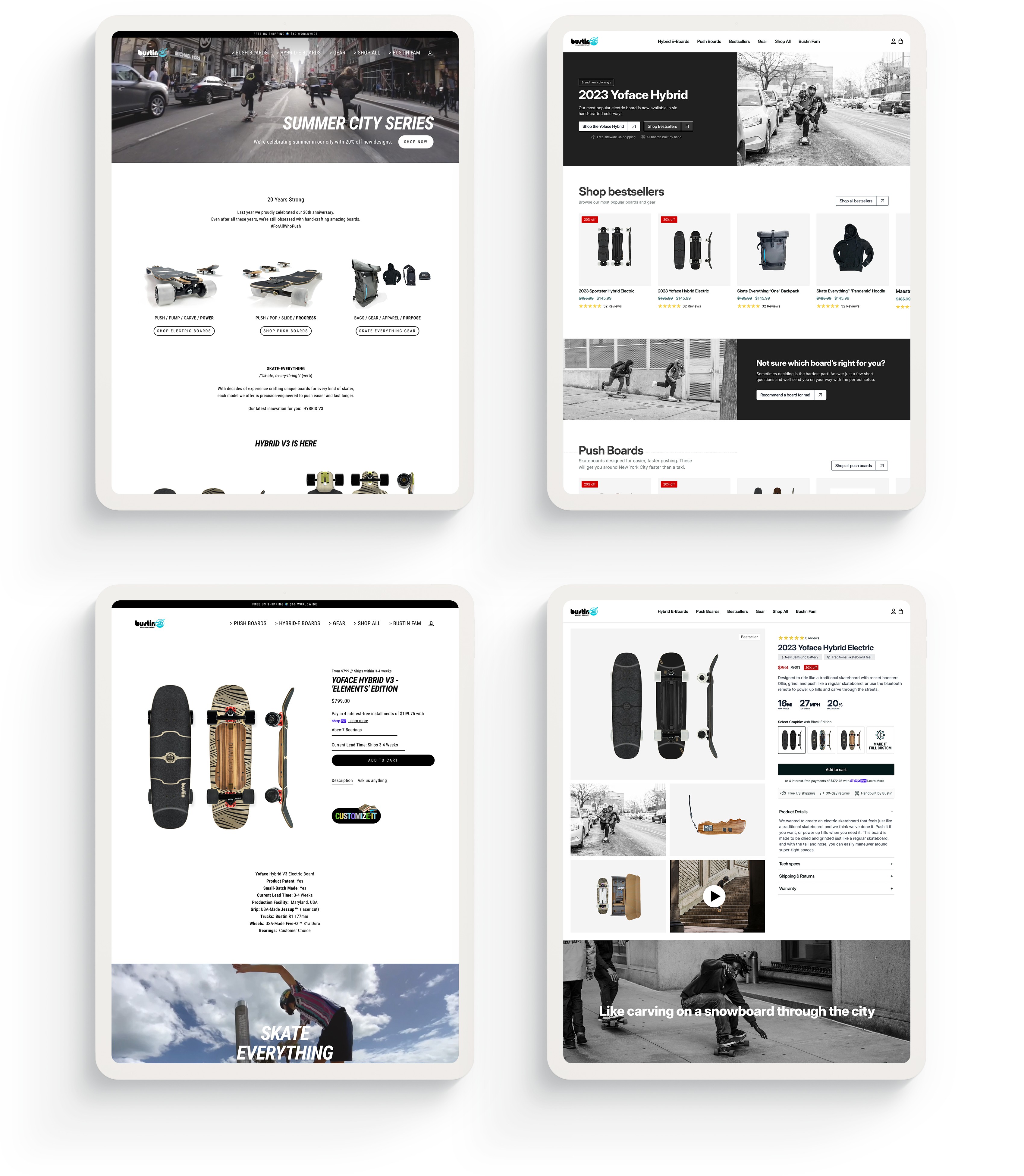
For example, rather than using a prototypical hamburger menu, Bustin's mobile menu was a full-width CTA pinned to the bottom of the screen. Additionally, PDPs used dropdown menus rather than segmented buttons for variant selectors with just 3-4 options.
Visual design
The site had a number of visual design issues encompassing alignment, consistency, visual hierarchy, typography, and more. As one example, the site used a condensed font for body copy throughout its entirety, impairing readability.
Page size
Bustin's website was heavily peppered with auto-playing skate videos. On one hand, this was apt: skaters love watching skate videos. On the other hand, many of these videos exceeded 100MB in size!
Process and challenges
As part of a small team overseeing a portfolio of DTC brands within a fast-growing ecommerce aggregator, my efforts were split between 5-10 projects at any one time. In addition to being responsible for design and development, I also managed the Shopify stores for all brands, facilitated integrations with external platforms such as omnichannel inventory management systems, and led various other technology initiatives.
Given this, as well other resource and time constraints, the timeline for this project allowed for considerably less research, diligence, and attention to detail than I would have liked. Nevertheless, the following considerations informed the redesign:
I often start a DTC redesign with a heuristic analysis via the Baymard Institute's usability-testing informed findings, particularly when there's insufficient time for on-site surveys, long-term data collection, A/B testing, and other research.
An email survey was sent out to previous customers, asking them a series of questions about their familiarity with hybrid skateboards—a category of skateboards that Bustin Boards brought to market, and their most popular products—before purchasing one. These findings informed the degree of education around hybrids provided on PDPs.
GA and Shopify data revealed several underperforming pages and products to which considerable homepage and ad traffic was being sent. These and other findings helped inform some of the IA changes as well as which categories and products to feature on the home and landing pages.
In-depth conversations with the founder unearthed compelling value propositions previously omitted from the site, and conversations with the CS team helped me identify questions frequently asked by customers but not addressed by any existing site content.
Outcome
A ~10% increase in visitors who made it to PDPs, likely the result of simplifying the site architecture and removing unnecessary intermediary landing pages
An ~18% increase in add to cart rate for visitors who made it to PDPs
A ~7% increase in checkout completions for visitors who added products to their cart