ROLE
Platform
Responsive web
Overview
The Amish House is a bootstrapped retailer of Amish furniture with over 1,000 configurable products and 2M+ product variants. As partner and head of digital, I owned the design, development, and optimization of our Shopify store, as well as all digital brick-and-mortar initiatives. Over four years, I helped scale the company from launch to $1.5M+ in annual revenue with effectively zero marketing budget.

As one of a two-person team, the challenges we had to surmount were numerous and varied. Below are a few examples:
The Amish House offers 2M+ product variations across more than 50 product categories. Creating spreadsheets for and importing these to the website presented a considerable challenge.
To overcome this, I built a simple python-based web app to generate product import spreadsheets from manufacturer pricing sheets, which varied considerably in their format and quality. Using this tool, we were able to generate and upload product spreadsheets for 1M+ product variants in several weeks.
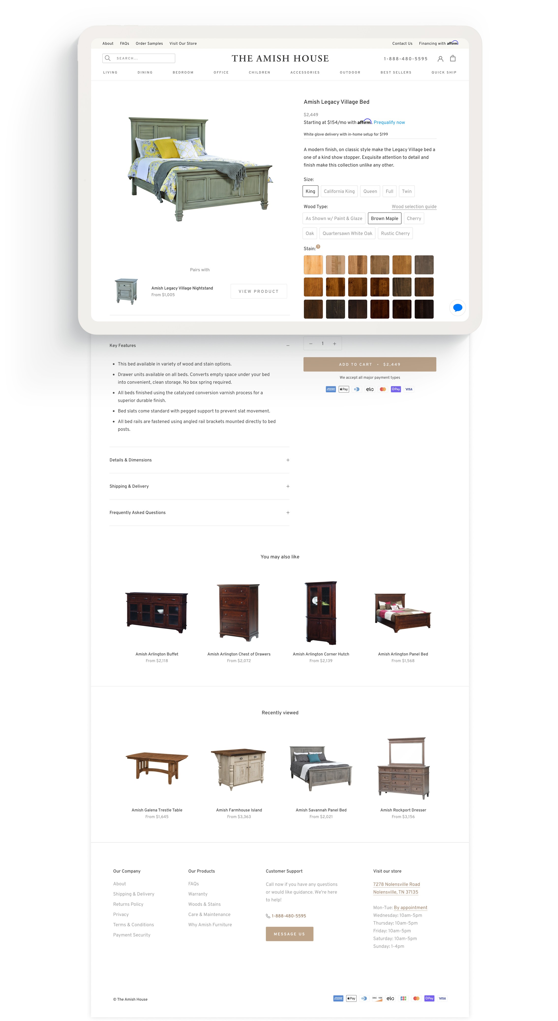
As I designed and built out PDPs, I reviewed usability testing findings, sales calls, support emails, and other data to answer: what questions might visitors have as they browse our products, and how can we answer them in the right place and at the right time as they arise? This consideration manifested in a number of design decisions:
Wood selection guide: to help visitors navigate the myriad decisions they must make as they customize their furniture, I added a wood selection guide to the wood selection interface, which opens as an on-page modal to keep visitors on the PDP.
Reassuring microcopy: to assuage visitors' hesitations and potential indecision around selecting a stain, a hover tooltip on the stain selector lets customers know they'll receive stain samples for approval, with up to three more at no charge, before their order is finalized.
Dynamic shipping info: unexpected shipping costs and timelines are common causes of cart abandonment for custom furniture. We wanted to ensure this information was communicated clearly upfront. To that end, I implemented 'Get it by' messaging that displayed shipping times dynamically depending on product category, as well as clearly communicated our flat-rate shipping costs and the level of service.
Enlarged stains upon hover: when users hover over a stain swatch, an enlarged image displays in a tooltip, allowing them to gain a better sense of the wood's unique characteristics, grain, and coloration.


